Branding
Solstice Brand Identity
A complete brand identity system for a lifestyle company rooted in warmth and intention.
A complete brand identity system for a lifestyle company rooted in warmth and intention.
Solstice came to us with a vision: to create a brand that felt like morning light — warm, inviting, and full of quiet possibility. They wanted their identity to reflect the same sense of calm intention that defines their products.
We began by stripping everything back to essentials, finding the core gesture that would carry through every touchpoint. The result is a system built on restraint — where every element earns its place and nothing competes for attention.
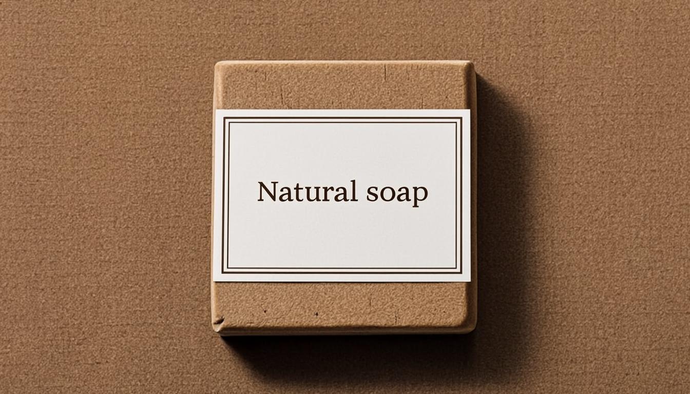
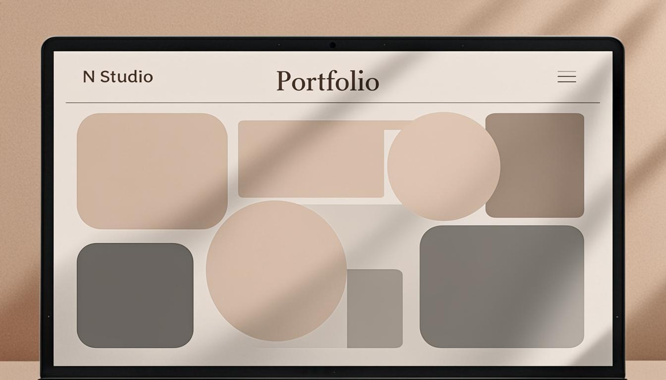
The typography draws from classical proportions with a contemporary sensibility, paired with a colour palette inspired by natural stone and soft clay. Together, these elements create a visual language that speaks softly but resonates deeply.
From packaging to digital presence, every application of the Solstice identity was considered as part of a cohesive whole. The system is flexible enough to grow with the brand, yet distinctive enough to feel unmistakably theirs.